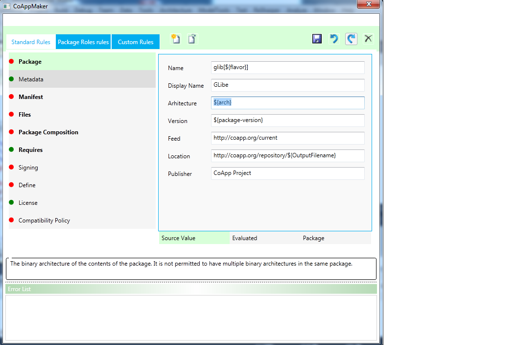
Main parts are:
List of Package Rules on the left side and rule's details on the right side.
The Rules with Bold font are Mandatory rules and with Normal Font are optional rules.
The Color Green or Red show if edited rules contains some errors or no.
Available Buttons
There are two groups of the buttons :
[ Open, New]
[ Save, Undo, Redo, Reset ]
In the bottom part is a Panel containing help tip and errors list. ( it is possible to resize these parts using splitter)
Help Tip
When a UI control (ex.,text box) is focused the help tip is displayed in the GroupBox.
Errors List
Error List Header color is green when there are no errors, if is red at least one error exist it become red.

Validation Rule on each Property:

Is made by adding validation rules directly on binding:
<Binding Path="Version" >
<Binding.ValidationRules>
<local:ValidationRule ValidationStep="UpdatedValue" ValidatesOnTargetUpdated="True"/>
</Binding.ValidationRules>
</Binding>
->The red border for the Textbox, when validation rule returns false is default behavior.
In the top part is a place reserved for the menu/ navigation bar (is left blank now). Possible options are: File Editor (Working part), Quick Edit (drap and drop tool), Help.
Idea with green and blue colors came from CoApp Style:

No comments:
Post a Comment